Quick start guide
This packages implements methods described in the paper:
Exact decoding of the sequentially Markov coalescent
Caleb Ki, Jonathan Terhorst
bioRxiv 2020.09.21.307355; doi:10.1101/2020.09.21.307355
The methods are implemented in a Python package called xsmc. The package has two main uses: drawing exact samples from the posterior distribution, and fast estimation of the maximum a posteriori (MAP) path. Convenience methods are also included for plotting.
We will demonstrate how the method works on simulated data using msprime.
[3]:
def simulate(recombination_rate, length, sample_size=2):
    return msp.simulate(
        sample_size=sample_size,
        mutation_rate=1e-8,
        recombination_rate=recombination_rate,
        Ne=1e4,
        length=length,
        random_seed=np.random.randint(1, int(4e9)),
        demographic_events=[
            msp.PopulationParametersChange(time=0.0, initial_size=1e5),
            msp.PopulationParametersChange(time=1000.0, initial_size=1e4),
        ],
    )
All methods are accessed by creating an instance of the xsmc.XSMC class. The class has three required arguments:
ts, atskit.TreeSequenceinstance containing the data.focal, the node id of the focal haplotype ints.panel, a list of node ids intswhich are potential targets forfocalto copy from.
First, we focus on the simplest type of analysis, where we have two chromosomes sampled from a singled diploid individual.
[4]:
from xsmc import XSMC, Segmentation

data = simulate(recombination_rate=1e-9, length=1e6, sample_size=2)
xs = XSMC(data, focal=0, panel=[1], rho_over_theta=0.1)
Exact sampling
To sample paths from the posterior, use the XSMC.sample().
[5]:
paths = xs.sample(k=100, seed=1)
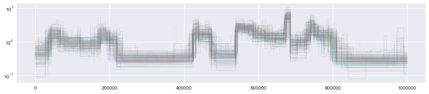
The returned object is a list of length k of Segmentation objects. These objects can be easily plotted to visualize the posterior:
[6]:
for p in paths:
    p.draw(alpha=0.1)
plt.yscale("log")
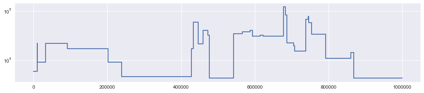
To compare the posterior with the truth, we can use built-in convenience methods to turn data into a Segmentation object and plot it.
[7]:
truth = Segmentation.from_ts(data, focal=0, panel=[1])
truth.draw()
plt.yscale("log")
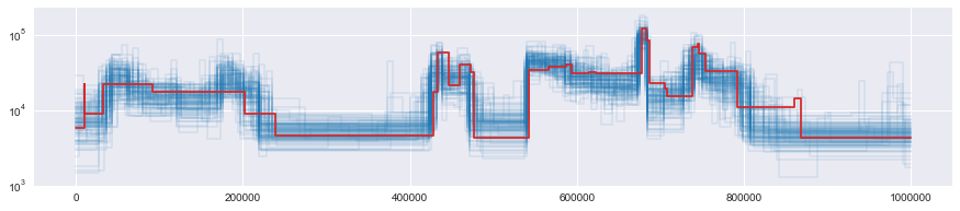
Rescaling the output
You may notice that the \(y\) scale of the above plots is different. By default, Segmentations returned by XSMC are in units of coalescent time. This matches the scaling of the Li & Durbin’s PSMC.
To convert these times to generations, you must know the biological mutation rate \(\mu\), and then estimate \(N_0\) by the formula \(N_0 = \theta / (4 \mu)\):
[8]:
N0 = xs.theta / (4 * 1e-8)
Then, you can convert time to generations by multiplying by \(2N_0\).
[9]:
for p in paths:
    p.rescale(2 * N0).draw(
        color="tab:blue", alpha=0.1
    )  # divide by the mutation rate used in the simulation, convert to haploid
truth.draw(color="tab:red")
plt.yscale("log")
# plt.ylim(0, 1e4)
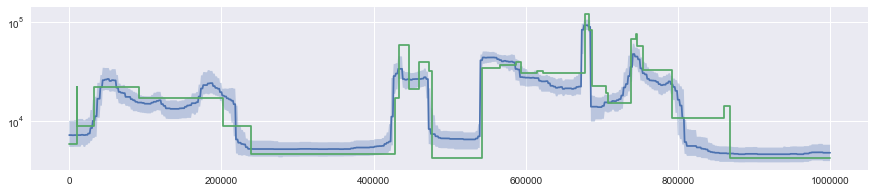
Computing functionals of the posterior
The Segmentation.to_pp() method can be used to get access to the raw stepwise function it represents (returned as a piecewise polynomial, whence the name). By calling this method on paths returned from XSMC.sample_paths(), this you can compute functionals of the posterior distribution.
[10]:
x = np.linspace(0, data.get_sequence_length(), 1000)
y = np.array([p.to_pp()(x) for p in paths])
q = (
    np.quantile(y, [0.25, 0.5, 0.75], axis=0) * 2 * N0
)  # faster than calling .rescale() on each path
plt.plot(x, q[1])
plt.fill_between(x, q[0], q[2], alpha=0.3)
truth.draw()
plt.yscale("log")
Multiple samples
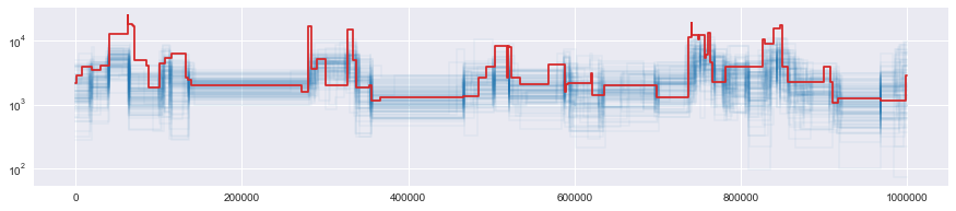
We can analyze multiple samples using a “trunk approximation” described in the paper. In this case, the returned segmentation approximates the earliest time to coalescence with any member of the panel.
[11]:
data = simulate(recombination_rate=1e-8, length=1e6, sample_size=20)
focal = 0
panel = list(range(1, 20))
xs = XSMC(data, focal=focal, panel=panel, rho_over_theta=1.0)
paths = xs.sample(k=100, seed=1)
[12]:
N0 = xs.theta / (4 * 1e-8)
for p in paths:
    p.rescale(2 * N0).draw(color="tab:blue", alpha=0.05)
truth = Segmentation.from_ts(data, focal=focal, panel=panel)
truth.draw(color="tab:red")
plt.yscale("log")
Viterbi Decoding
The other function of the XSMC class is to compute the Viterbi/most probable path under the posterior:
[13]:
data = simulate(recombination_rate=1e-9, length=10e6, sample_size=10)
xs = XSMC(data, 0, [1, 2], rho_over_theta=1e-9 / 1.4e-8)
N0 = xs.theta / (4 * 1e-8)
map_path = xs.viterbi()
map_path.rescale(2 * N0).draw(label="viterbi")
Segmentation.from_ts(data, 0, [1, 2]).draw(label="truth")
plt.yscale("log")
plt.legend()
[13]:
<matplotlib.legend.Legend at 0x7f0493c47190>
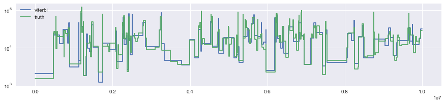
Note that each path also includes a haplotype component which is not plotted:
[14]:
map_path.segments[0]
[14]:
Segment(hap=2, interval=array([ 0, 476205]), height=0.08770837623933274, mutations=21)
This says that the first segment in the MAP path had height 0.09 (in coalecent units) and coalesced with panel haplotype 2.
[ ]: